The National Kitchen and Bath Association recommends that kitchen makeovers should cost about 15% to 20% of the home value. Clearly, kitchen remodeling is one of the most expensive projects you will undertake as a homeowner, and most homeowners will gladly invest in the upgrade. After all, the 2022 Cost vs. Value national report says that homeowners can receive over 70% return on their investment into a kitchen remodel.
But not every kitchen remodel will fetch you 70% returns. It should be a tasteful upgrade that enhances your kitchen appeal. There are many interior design faux pas that may render your kitchen looking worse than it originally was. Here are some common design blunders that can make your kitchen design look unappealing, cheap, and worse than before.

Adding Fluorescent Lighting
It is no secret that lighting can make or break the vibe of a room. In a kitchen, lighting becomes even more important. One of the worst decisions you can make is to pick fluorescent lighting for your kitchen ceiling. Florescent lights tick all the checkboxes on the list of what a lighting solution should not be – harsh on the eyes, unflattering to look at, and not in sync with the kitchen’s ambiance. As soon as you mount a fluorescent light on a kitchen ceiling, you bring down the appeal of your kitchen.
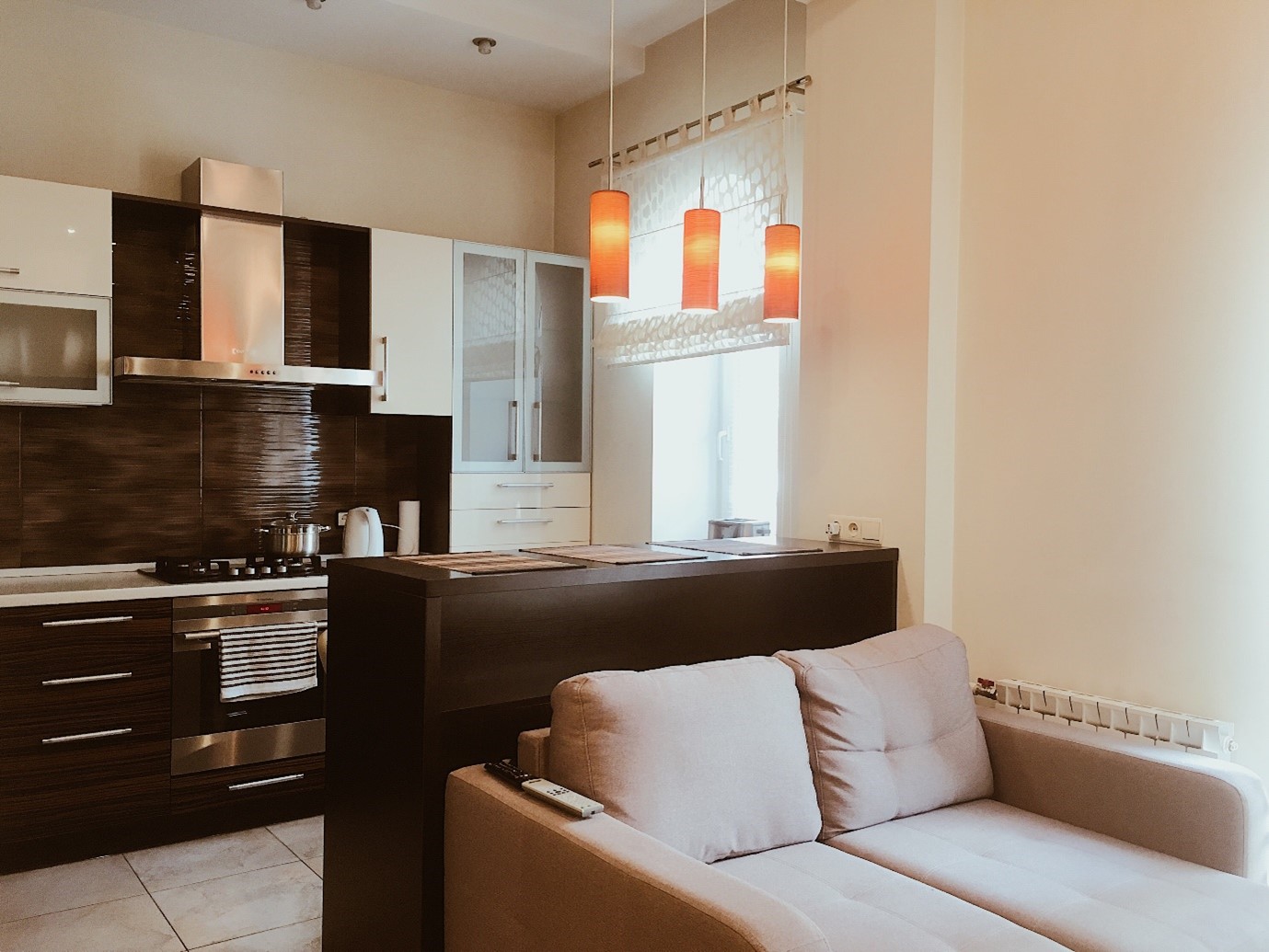
Get the fluorescent light down and install different lighting solutions. You can use pendant lighting over the kitchen island or the counter. You can add softer, recessed lighting for the rest of the kitchen. You can also use linear track lighting to make the kitchen look sleeker and more modern.
Choosing a Short Backsplash
Irrespective of the cost of the material you choose, a backsplash that does not run the entire length from the countertop to the bottom of the cabinetry will lend your kitchen a cheap look. Get rid of the shorter backsplash and replace it will a full-length one.
It would also serve you well to keep the color of the backsplash either the same or at least similar to the countertop. You already have the many colors of the kitchen walls, floor tiles, and cabinetry to handle. You don’t want to throw a new color into the mix and make your kitchen look like a box of crayons.
Finally, unless you have really tall ceilings, stretch your cabinetry to the ceiling. If you do not want to spend money on a full renovation, you can use faux cabinetry. Paint them the same color as your original cabinetry, and you are done.
These changes elevate your kitchen by naturally pulling the eyes up and making the kitchen look taller. It will also make the kitchen feel more spacious than it really is.
Unoptimized Storage Layout

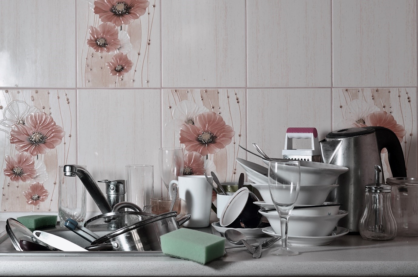
Too much storage in the kitchen makes it look clumsy. Skimp on the storage space, and all your utensils and cutlery will be out on the counter, making the kitchen look cluttered. Both design mistakes will make your kitchen look cheap. So, optimize your storage layout.
A characteristic of luxurious kitchens is the number of drawers they have. Base cabinetry is not really optimized for storage. You can retrofit drawers into these cabinets, which will make it more convenient for you to reach your stored items.
If you are redesigning a kitchen, consider how to incorporate drawers instead of big box storage. It will not just amplify storage space but also make the storage more accessible too. After all, luxury is all about ease of use and the beauty of design.
Inconsistent Use of Colors & Materials
It is common for homeowners to repair kitchens only when the need arises. While it fixes the functional problem in the kitchen, it completely spoils its beauty. You end up with a kitchen with new tiles alongside old ones, different materials on the countertop and backsplashes, kitchen walls that are out-of-sync with the cabinetry, lighting that does not accentuate the kitchen’s design, and other issues. Inconsistency points to the afterthought in design and makes the kitchen look cheap.
Instead of repairing your kitchen cabinetry, counters, or lighting as the need arises, take a step back, and analyze the situation. Create a plan and then make the necessary changes. You do not have to use the most expensive material but the right colors, textures, and lighting.
Cluttered Golden Triangle
There’s a golden triangle in your kitchen with the stove, sink, and the refrigerator on each edge of that triangle. Create enough space between these three elements, ideally anywhere between 4 feet to 9 feet. Keeping the golden triangle this wide will prevent unnecessary movement in the kitchen and prevent clutter from accumulating on the counter.
When you don’t follow the golden triangle rule, you create a lot of clutter in the kitchen. In the process, it always looks unkempt. It goes without saying that any upgrade that creates clutter makes your kitchen look smaller and unappealing.
A Luxurious Kitchen Is Not Expensive; It’s Designed with Care

Luxurious kitchens usually have few distractions. These minimalist kitchens have a cohesive color pallet, are easier on the eyes, and display great attention to detail.
To make sure you don’t end up with a cheap kitchen design, know the color and material of every tile and stone that’s going to be a part of the kitchen. Measure your kitchen so you know where every appliance goes and fits perfectly. Also, choose the right lighting to illuminate every corner of the kitchen.
Consulting A Professional is the most reliable way of making your kitchen look good. An interior designer will make sure that you don’t waste your money on “cheap” options and invest in the kitchen design that enhances your home’s retail value.